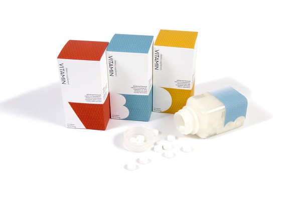
According to the packaging designers, the first five seconds on the shelf are crucial to attracting consumers. But they are not and should not be the only selling point for a commodity. For a long time, I have been deeply impressed by the excessive packaging of beautiful consumer goods on retail shelves. Most of these packaging are artistic, and some have applied exaggerated or contrasting, simple, quirky and even humorous artistic techniques. If the packaging is only "art for art", then these packaging is very admirable, but it is not, right? However, artistic packaging is filled with the blogosphere of designers, dealers, and brand managers. Some even won prizes. There is nothing wrong with admiring beauty, but it does not necessarily have to go to selling branded products. To support this point of view, I have repeatedly observed the goods on the shelves of food stores, toy stores, body care stores or other stores. Take a look at our packaging. Find a feature that you think is particularly attractive. Can you tell me at a glance what the product is? Can you identify its brand? Next, can you point out what makes this brand more satisfying than the adjacent product on the shelf? About five years ago, I wrote an article titled "20 seconds to decide whether to die or die." The article points out that the average browsing time of consumers on retail shelves is 20 seconds, and explains the importance of their own, as well as the importance of developing effective brand packaging. For a brand, the packaging of the most beautiful consumer goods that are not sold on the shelf does more harm than good; it means wasting marketing costs and losing the opportunity to engage with customers. After this: An article on PackagingDigest recently revealed that research shows that consumers have only five seconds to make purchase decisions for goods on shelves. Five seconds! This is not surprising for consumers who are subjected to verbal and visual bombardment 24 hours a day, seven days a week. Consumers have become very good at blocking most of this kind of stimulus. So, for packaging, besides making products and brands attract consumers' shorter attention periods, is there a more urgent task than that? Marketers need to seek balance by sharing the unique attributes of the brand, developing attractive packaging, and communicating consumers in a convincing manner. Isn't this what packaging should do when it is fully utilized? In the increasingly commercialized context, consider how a new product (eg, children's juice) can be effectively packaged to highlight its subtle main features on crowded shelves. Bright, entertaining packaging labels fill retail shelves, although some of these brands have a unique packaging structure. Good2grow juice stands out from all other general brands on the shelf. Co-branding tends to reflect the children's favorite entertainment performance, but these features generally do not appear on the packaging label. They are generally found on the top of thermoformed, unusually shaped drinking bottles (Sippa Tops) so that they can be easily consumed by young children and children. Recently, some licensing features have appeared on the good2grow bottles: Hello Kitty, Thomas Tank Engine, Dora the Explorer, Hulk, Disney Princess Sofia, Mickey and Minnie, Pigeon and Little Buddha, Barbie, Captain America. As well as the ninja turtle crown, children are also happy to collect these. [pagebreak] The wraparound label depicts brightly colored fresh fruit and limited oral brand communication: "100%" fruit, "no sugar" - this is very important for parents. There is also a replacement combination, parents can simply put SippaTops juice into a juice bottle. This is a very good brand package! How to release a new package? Although it has established a good image for its brand products, Method continues to disrupt product placement in each category through constant packaging innovation, exceeding customer expectations. To enhance the company's sustainable development message, Method's Dish+Hand soap is packaged in a drop-like package that is partly made of recycled marine plastic and partly made of post-consumer recycled plastic. This is a natural environment. Kinds of benefits. The molded "water droplets" are part of a unique packaging structure. The neck label depicts a fish and a phrase: "a bottle made of marine plastic" while enhancing the brand's spread. Simple, but very deep; able to stand out on the retail shelf. How to pack destructive products in new categories? Hasbro pointed to the packaging of Nerf Rebelle (a sub-brand of the Nerf children's brand), a new generation of (girl) fighting toys. Whether it is to establish the reputation of the nearest heroine (Katniss Everdeen in the hungry game) or to urge girls to use their own Nerf weapons to “complain†the male friends and brothers and sisters past Nerf shock wave attacks, Hasbro has Rebelle's shock wave production line has been successful. The packaging of pink, red, and purple colors not only brings attractiveness but also does not remind people of the traditional concept of "Girls' Series". It is not an attempt to create a "soft" version of a boy's brand to attract girls. In fact, it fully embraces the positive attitude of the Nerf brand in terms of product style, branding and graphics, and active product names such as Heartbreaker, PinkCrush, and SweetRevenge. The uniqueness of NerfRebelle is manifested in: different colors and designs of darts (which can be used as collectibles), NerfRebelle app, which enables girls in the group to communicate with each other in the shock wave battle. Brand communication warned the girls to "take steps and stand up." Therefore, the information was authorized. It is hoped that under the leadership of Hasbro, more toy brands will emerge in this inspiring new field. Simple packaging: Is it valid? All popular simple packaging is accused of doing more. Although recklessly reducing visual and verbal cues, they still have to sell products and brands. The packaging must make people quickly grasp the points, otherwise it will not be able to sell. Incase is a brand that successfully achieves this. The company is known for its iPhone and iPad accessories, and recently competed with the headset products of Apple retail stores, so it had to be simply packaged to meet Apple's standards. Apple's specifications for new packaging requirements are very stringent: Regardless of the width of the headset, it must be able to accommodate specific footprint needs within the retail store. The packaging design budget is half the industry standard, so it has to reach the factory within four weeks instead of the usual eight week minimum cycle time. Not only must the accessories arrive at the factory one week in advance, but the packaging should arrive within the next four weeks. The solution is: In order to make the earphone placed in the package reasonable, use side placement. The packaging design meets the high expectations of Apple retail stores. Special surface materials, surface printing colors, and window display (a feature of Apple products - high-grade appearance and feel) are all completed in the packaging design. Simple and elegant product design highlights the choice of high-tech black and gray backgrounds, monochrome headphones. The Incase logo appears in the upper left corner of the front of the package, as well as in the vertical part of the side. The product has a good visual experience, the comfort of sponge sets and the commitment to performance. Brand communication is limited to "headset" or "portable" product names. At the bottom right of the package, the compatibility of ipad, iPod or iPhone products is marked. This is a perfect combination of Incase and Apple brand packaging. Each category of product has a variety of options, so how can packaging be commercially viable while maintaining aesthetics? How do you point out the expectations for a brand in a number of other products within five seconds? The beauty should not be placed before the brand. The brand is the most important of all. Packaging and other marketing activities must stand out in front of the truly important group—consumers. Article source: China Packaging Network If you need to republish articles, please indicate the source or keep the original source path High-quality materials stretchable mesh dome wig is made of high-quality nylon material. Wig cap is made of soft, breathable, durable and stretchy nylon material. Comfortable and breathable when wearing, not easy to tear and deform. Wig Caps,Breathable Mesh Wig Cap,Dome Wig Cap,Wig Cap For Wig Making Xuchang Le Yi De Import And Export Trade Co., Ltd. , https://www.alileaderbeauty.com


Non-slip Elastic Band to keep the wig longer, each dome cap for wigs has a wide elastic band. Which is not easy to fall off and protect the skin.
Appropriate size which make the hair fit perfectly to the head so that the hair is not exposed when wearing a wig.
The wig cap can make your wig making easier and protect your hair well. Keep your wig clean meanwhile helps securing your natural hair and prevents the breakage.
Suitable for long hair, short hair, straighten hair and curler hair.this black wig cap for women men will be your ideal choice.